I started with the core campaign idea of confidence and explored visual metaphors that could express clarity, complexity, and risk across different sectors. It was important that we did not rely on generic imagery like wind turbines, solar panels, or power grids, which are heavily used by competitors.
We needed to stand out on the page, in a feed, or across a tradeshow floor.
The process
I worked closely with the brand team and fellow designers to build keywords and mood boards, sketch early concepts, and challenge each other to go beyond literal representations.
We asked: What would confidence look like if you couldn’t use industry clichés? That process led to a series of distinct, symbolic concepts:
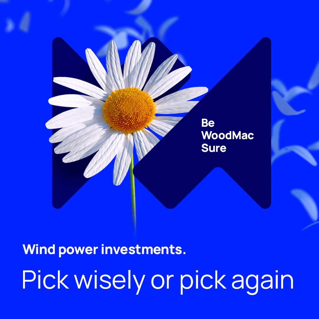
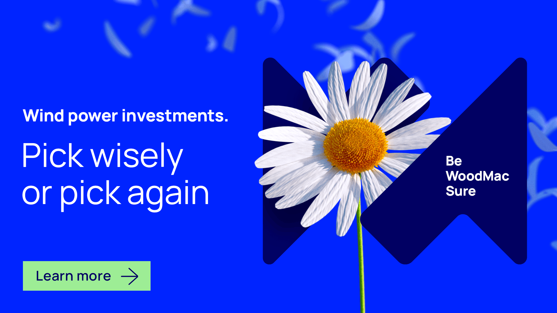
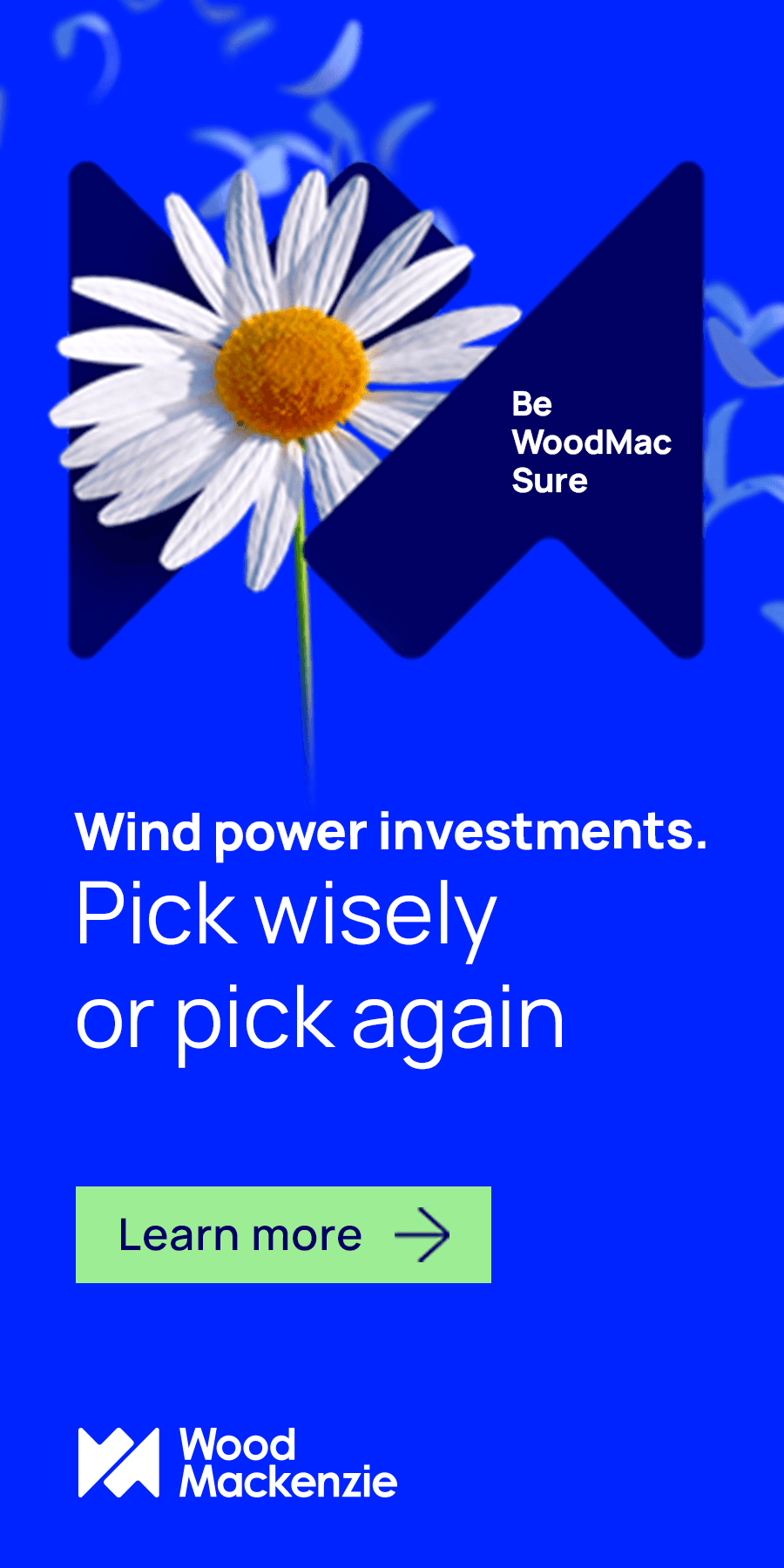
• A dandelion represented fragile decision points in Wind
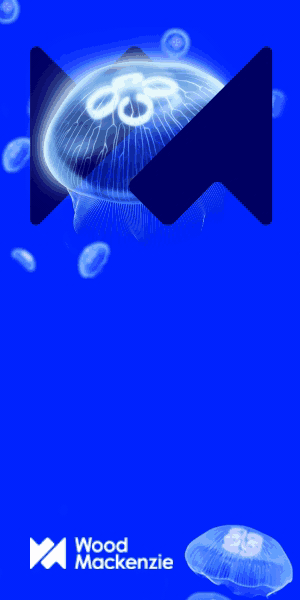
• A jellyfish captured elegant complexity in Power
• A butterfly symbolized transformation in Hydrogen
The process
I worked closely with the brand team and fellow designers to build keywords and mood boards, sketch early concepts, and challenge each other to go beyond literal representations.
We asked: What would confidence look like if you couldn’t use industry clichés? That process led to a series of distinct, symbolic concepts:
• A dandelion represented fragile decision points in Wind
• A jellyfish captured elegant complexity in Power
• A butterfly symbolized transformation in Hydrogen
We also ran into cultural differences across regions. Some imagery that seemed abstract and elegant in the UK felt out of place for a US audience. I helped guide the team toward visuals that worked globally, while still feeling distinct and true to the brand.
The result was a visual system that felt bold, thoughtful, and clear—just like the campaign message: Be WoodMac Sure.