Wood Mackenzie’s Brand relaunch
A modern, unified, and strategically positioned brand that reflects Wood Mackenzie’s role in the evolving energy landscape while strengthening its competitive edge.

In 2023, following its acquisition by private equity, Wood Mackenzie relaunched its brand to unify a fragmented identity. Years of growth, a diverse product portfolio, and multiple acquisitions had led to sub-brands with inconsistent visuals, diluting the brand’s impact.
The goal was clear:
Create a bold, streamlined identity that sets WoodMac apart, cuts through industry clutter, and simplifies sub-branding.

The result?
A cleaner, more sophisticated, and high-impact brand that reinforces Wood Mackenzie’s strength, credibility, and leadership in the energy transition.
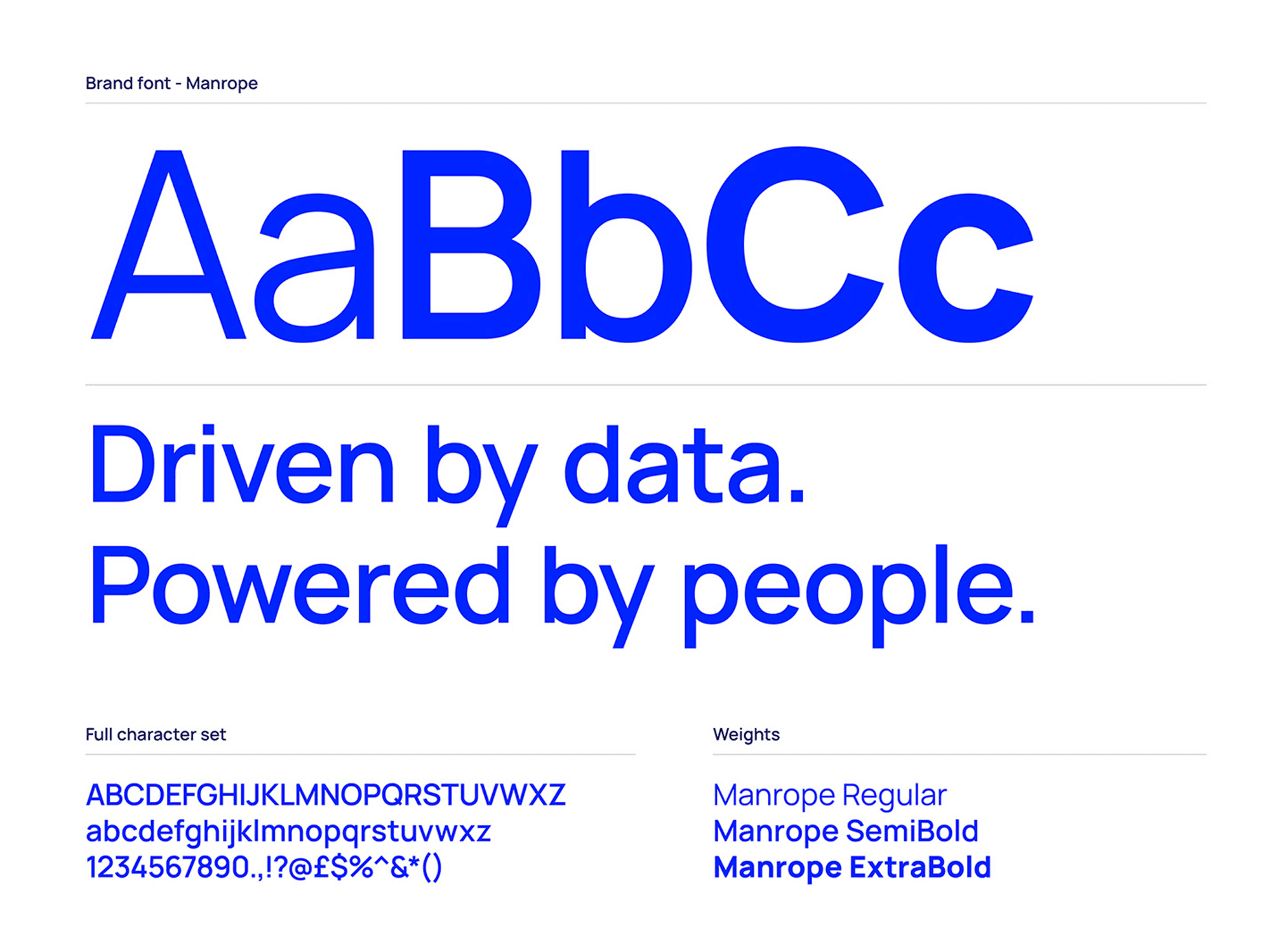
The brand font, Manrope, is a contemporary geometric sans serif that strikes the perfect balance between humanistic warmth and functional precision. It embodies our mission of uniting people and data with clarity and impact.
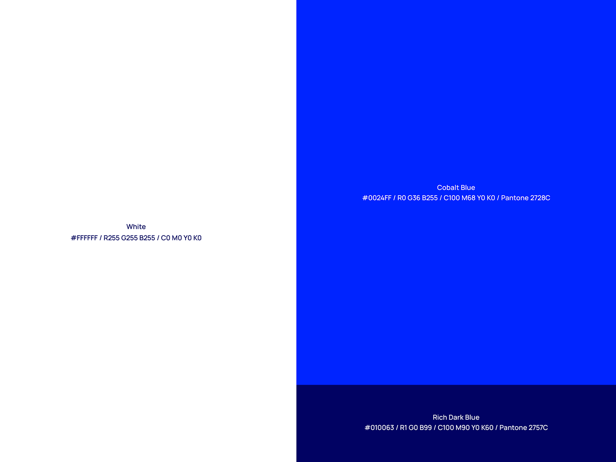
The color palette centers around two distinctive blues, creating a striking contrast on clean, white backgrounds. These colors are key to our brand’s bold and contemporary aesthetic.
WoodMac was moving from oil and gas to energy transition leadership, but its brand was outdated and inconsistent. Competitors were modernizing. I led the rebrand, working with an agency and the internal team to unify strategy and design.
Discovery & Research
Audited the brand and visuals to uncover gaps and modernization opportunities. Conducted competitive analysis to assess market positioning. Partnered with marketing, product, and sales to define key brand challenges and enhance perception, competitiveness, and digital presence.
Brand Strategy Development
Worked with the brand team and agency to define WoodMac’s energy transition strategy. Led creative workshops to refine positioning, tone, and visual storytelling. Created mood boards, design explorations, and brand pillars to align with new ownership and long-term goals.
Visual Identity & Design System
Led the development of a modern, scalable visual system for WoodMac’s digital future. Worked with an agency to redesign the logo, typography, and color palette for consistency. Directed internal teams and external partners to create a brand system for marketing, M&A integrations, and product UI. Built and documented brand guidelines in the company’s first DAM platform to ensure long-term consistency.
Messaging & Content
Collaborated with the brand team and content strategists to refine the brand voice and develop storytelling frameworks for consistent internal and external communications. Created employee engagement materials to empower staff as brand ambassadors.
Implementation & Rollout
Led the rebrand launch across digital and print for maximum impact. Designed key assets for the brand awareness campaign, ensuring consistency across web, social, and print. Worked with marketing and product teams to integrate the new identity into Lens©, optimizing UI for a digital-first experience. Provided creative direction for launch communications, aligning messaging across executive presentations, sales enablement, and PR.
Measurement & Evolution
Established brand success metrics with digital and regional marketing teams to track engagement and perception shifts. Gathered post-launch feedback to refine design and expand brand applications. Ensured the brand system stayed adaptable for future growth and acquisitions.
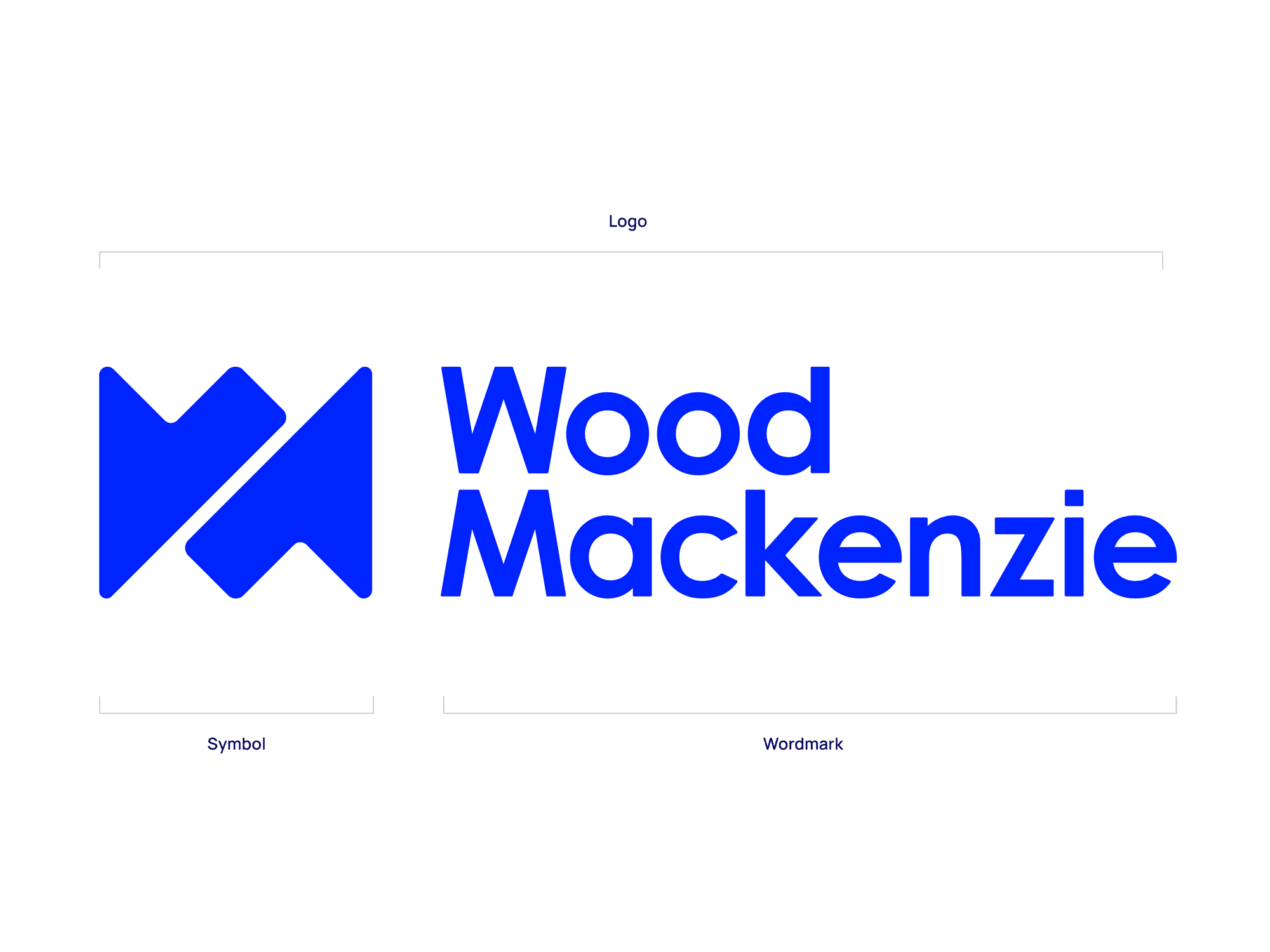
The brand was previously fragmented, with inconsistent styling, colors, and imagery across sub-brands. The refresh introduced a simpler, more cohesive system while preserving differentiation.
The Flex System introduced a dynamic approach, reimagining the emblem through varied angles, cut-offs, and placements. This allowed each product and service to have a distinct character while maintaining a unified brand identity.
The six flexes demonstrate how the symbol evolves as a graphic element, increasing in scale from left to right while maintaining brand cohesion.


The Flex System in action—showcases its versatility across different applications.
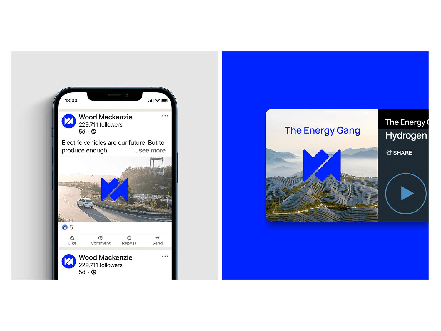


Explore how our refreshed branding comes to life across various applications in the images below:


Items shown: Branding applied across diverse infographic styles, including iconography, data visualization, pie charts, bar graphs, and maps.

Items shown: Brochure and display ads.

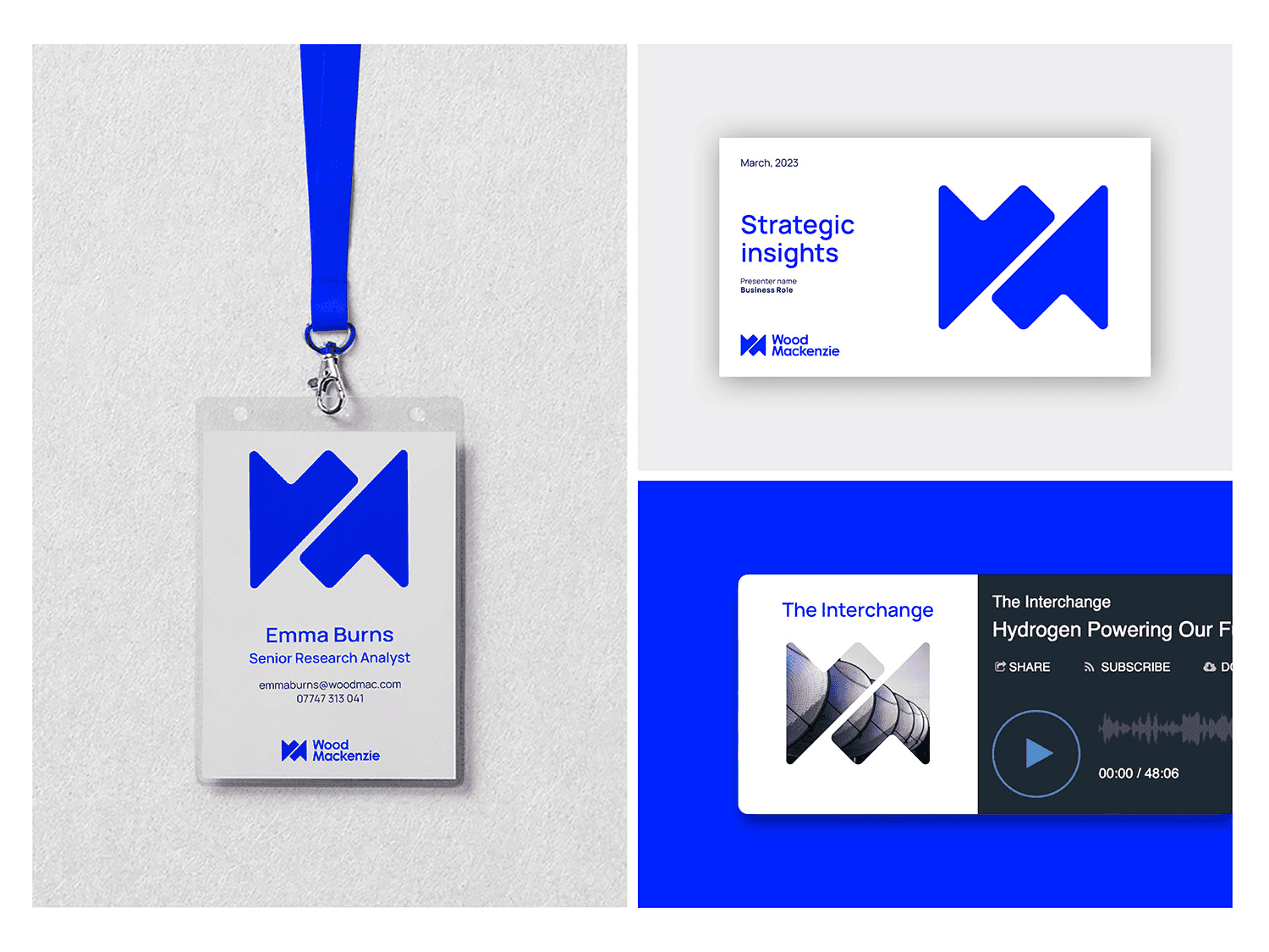
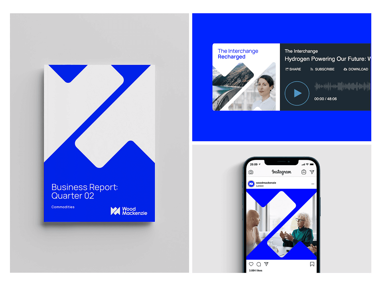
Items shown: Thought leadership, social and podcast identity.

Item shown: Flyer
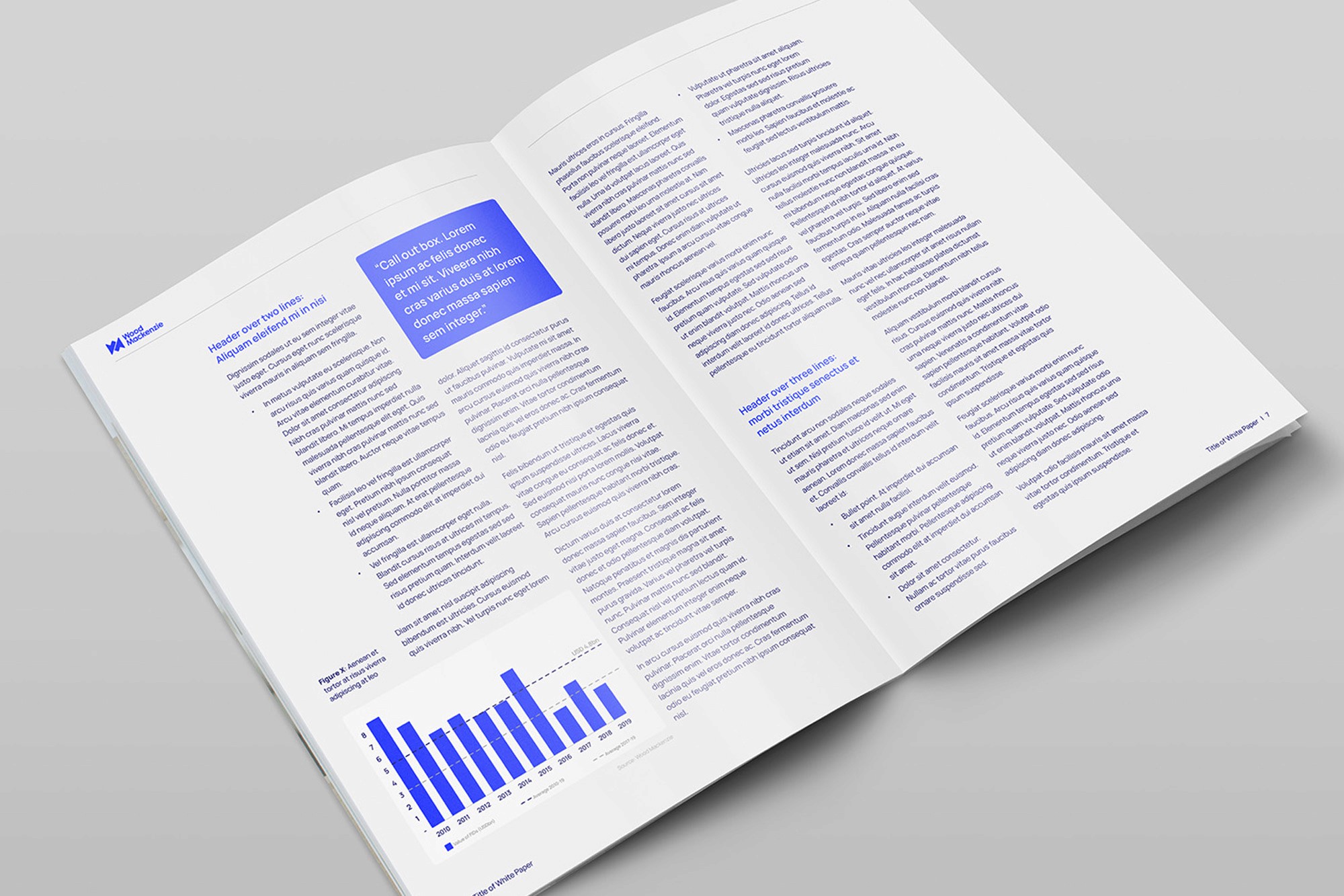
Items shown: White paper

Item shown: Slide deck template


Items shown: Website event cards (left image 1 , right image 2), event social post (left image 1 , right image 2 & 3), event digital signage (left image 1), roller banners (left image 1 , bottom image 5), and event signage (right image 1 , bottom image 5).