Unifying A Digital Brand

A Scalable Design System

Linear Background
Linear Background

The Challenge

The Challenge

The Challenge

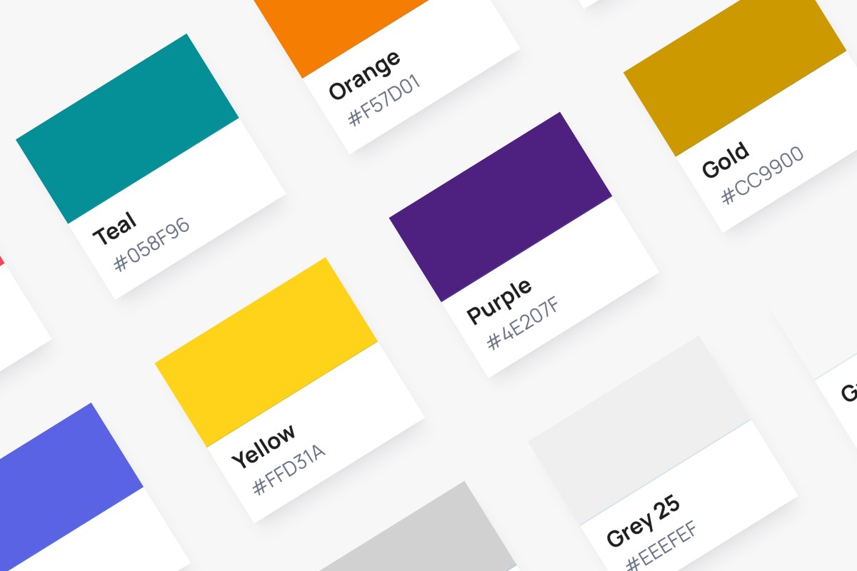
After multiple brand refreshes and acquisitions, Wood Mackenzie’s website had become a patchwork of inconsistent styles, outdated components, and fragmented branding. Updating pages was time-consuming, and handoffs between design and development lacked efficiency. There was no single source of truth for digital design, leading to misaligned user experiences across the platform.

Colors

Accessibility

The Objective

The Objective

The Objective

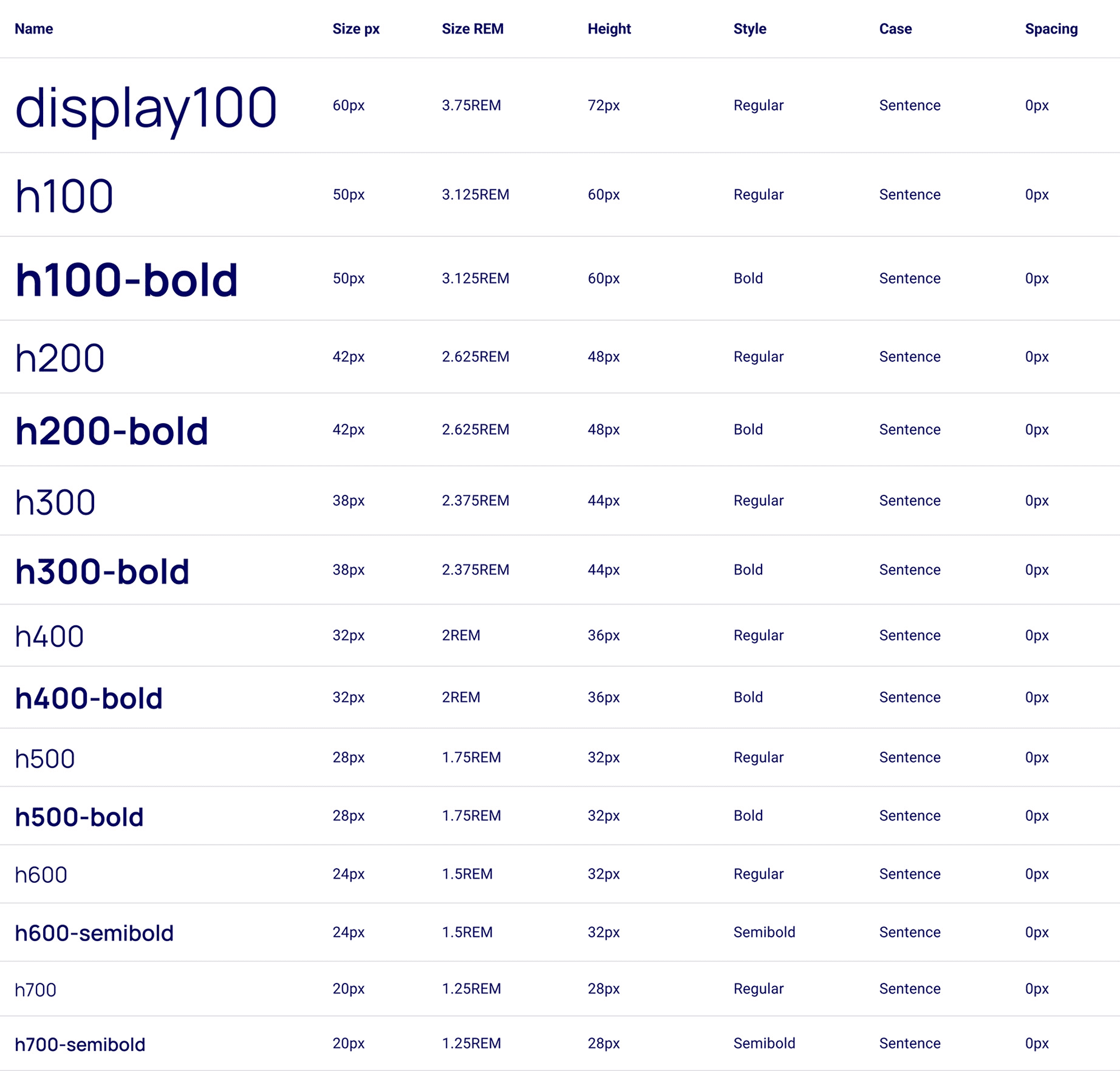
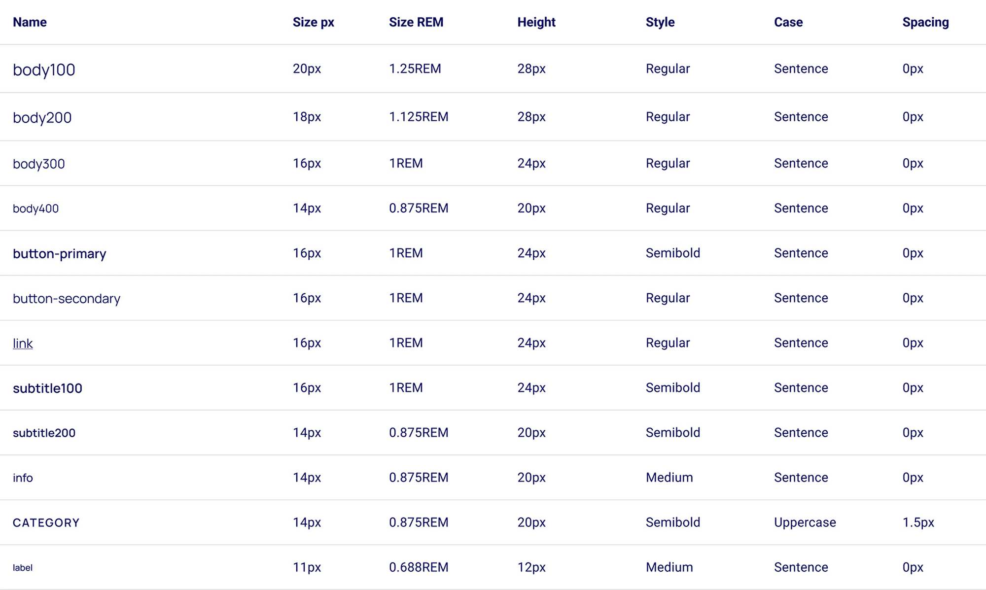
Create a comprehensive, scalable design system to unify branding, improve efficiency, and ensure consistency across all digital touchpoints.Provided clear CSS guidelines, boosting development efficiency.

Spacing

Illustrative icons

System Icons

The Approach

The Approach

The Approach

To solve these challenges, I led the development of Wood Mackenzie’s first official design system by:

Grid and Breakpoints

Auditing & Assessing:

Conducted a full review of existing components, identifying inconsistencies and gaps based on the latest brand guidelines.

Creating a ‘Design System Light’:

Built an interim catalog of current styles and components to provide immediate clarity while the full system was developed.

Building a Scalable System:

Established a structured framework for colors, typography, buttons, and UI elements, ensuring alignment with CSS best practices.

Collaborating Cross-Functionally:

Worked closely with developers to integrate the system into Storybook, enabling real-time documentation and testing.

Enhancing Efficiency:

Defined clear CSS guidelines to streamline updates, improve workflow between teams, and future-proof the design.

The Results

The Results

The Results

Consistency at Scale: Unified Wood Mackenzie’s brand identity across the website and digital platforms.


Faster Development & Design Handoffs: Improved collaboration between designers and developers, reducing friction and increasing efficiency.


Future-Proofed the System: Provided a strong foundation for continuous improvements and more straightforward implementation of future brand updates.

Typography - Desktop

Typography - Mobile

Typography - Cross Platform

Tools:

Tools:

Tools:

Storybook (UI documentation)
Dovetail (research)
Figma (design system & style guide)

Team:

Team:

Team:

Creative Direction & UI Design: Kristine LaRocca

Development: WM Developer